9 Ways to Improve Web Page Speed IMMEDIATELY
Stefan Petrov
November 13th, 2021
Seo
This article covers 9 really simple ways to immediately improve page load speed and your Google Lighthouse Score.
Read this article if:
- Your website loads slow
- You want faster page load
- You want to reduce bounce rate
- You want to rank better in search results
- You want to increase website speed
- You want more backlinks
- You want more organic traffic
Let's dive right into it.
1. Use a CDN like Cloudflare

CDN stands for content delivery network. It refers to a network of multiple servers located in different geographical locations to serve clients in different regions.
Clients in the US will receive data from servers located in the US, clients from Europe will communicate with European servers, etc. You get the point.
Using a CDN is probably the easiest thing you can do that will offer an immediate and noticeable page speed boost. If you don't already use a CDN I highly recommend you pick a provider and implement it as soon as possible.
Although I’m not affiliated with them, I use Cloudflare since they offer a free tier that is perfect for small businesses. Even their Pro plan costs just $20 a month, but I doubt you’ll ever need it.
Cloudflare’s free tier includes a globally load-balanced CDN right out of the box. They have over 250 different servers throughout most of North America, South America, Europe, Asia, and Australia. Other CDN providers such as Limelight, StackPath, and Fastly are available, but I don’t have experience with any of them.
To be honest, implementing a CDN sounds difficult but it isn't. Take Cloudflare for instance. All you have to do is sign up, enter some basic information, and then set up your name services to point to Cloudflare. I use Namecheap for my domain needs, and setting this up was extremely easy.
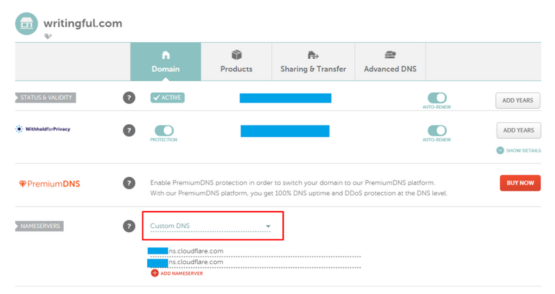
Select custom DNS from the dropdown options and have your name servers point to Cloudflare’s servers. That's really all there is to it.
Cloudflare pretty much takes care of everything else. There are a few optional extras you can enable with the free plan but don't mess with the settings unless you're absolutely sure you know what you're doing.
The great thing about Cloudflare is that it is so much more than a simple CDN. It offers numerous safety features like DDOS mitigation for instance and a free universal SSL certificate.
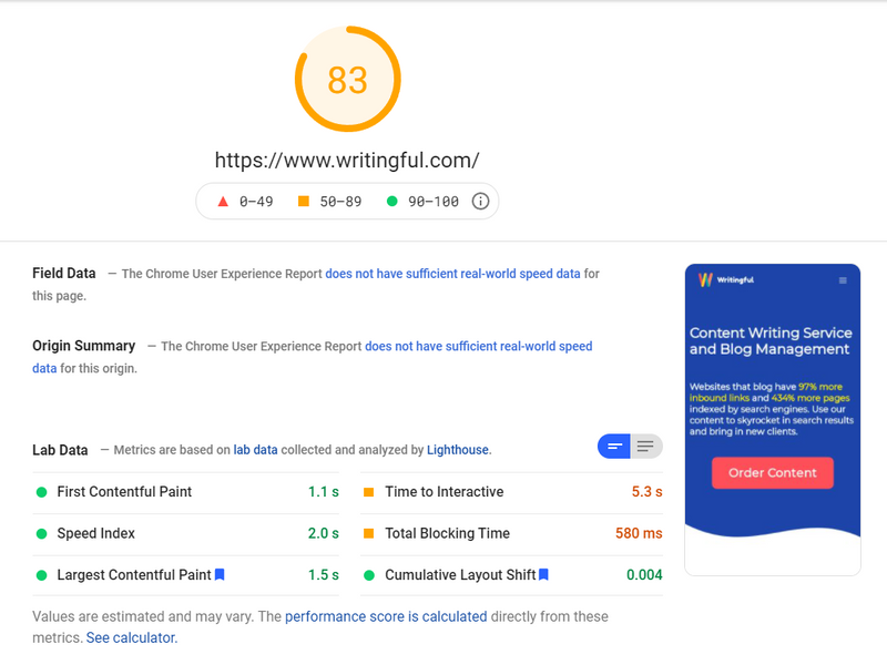
Take a look at the current PageSpeed Insights results for Writingful.
This is on mobile:
And this is the speed page insight on desktop:
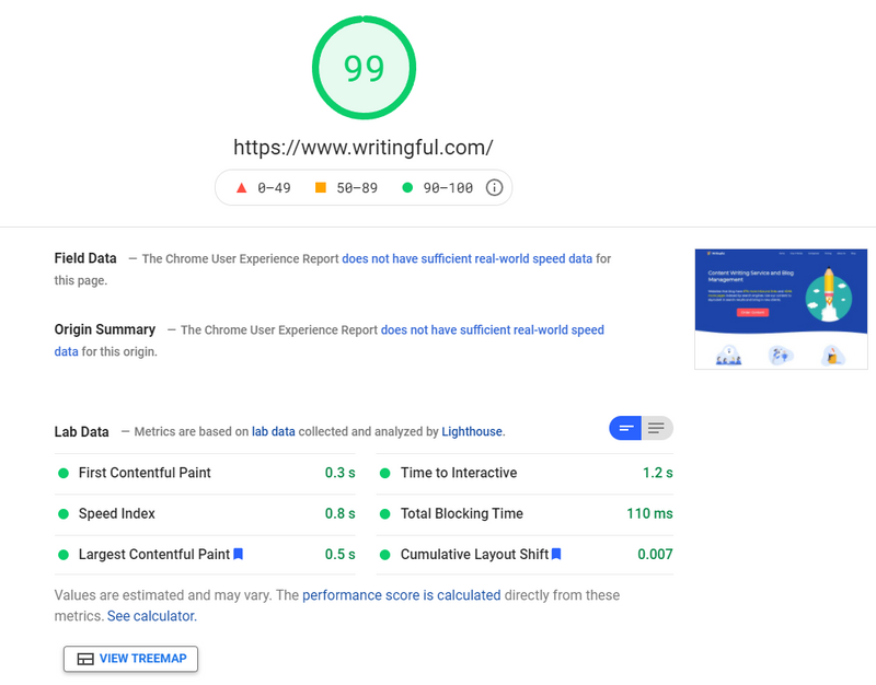
Cloudflare improved Writingful’s results for both mobile and desktop by over 10%. The mobile result used to be anywhere between 50 and 60, and for desktop that result hovered around 92. As you can see the latter now stands at 99 or 100 while the mobile result is well above 80.
2. Use Lazy Loading if Possible
Lazy loading is the practice of delaying resource initialization until the resource is actually needed. If you have a really large page on your website such as a blog with lots of images and videos, and you try to load everything at once, the user will have to wait a really long time.
What you can do to minimize this is avoid loading unnecessary objects that aren't in the user's viewport. I built Writingful using Next.js, and Next.js makes lazy loading extremely simple.
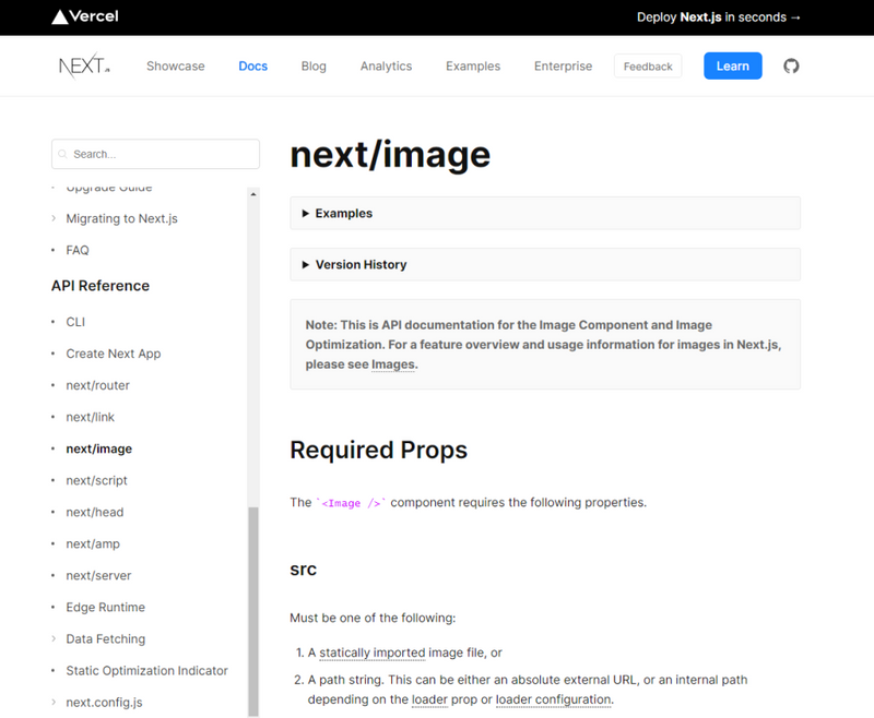
The provided image component implements lazy loading by default, so you don't have to do anything special. If you're not a developer I strongly suggest hiring one who will implement lazy loading.
Another benefit of lazy loading is that it reduces stress on the server and it decreases network bandwidth. Think of it this way. A lot of visitors will probably close your page straight away, with some making it halfway through and even less making it all the way to the bottom.
If you have a lengthy blog post with a lot of rich media, it doesn't make any sense to serve up every resource from the beginning. With lazy loading, your reader's web browser will request additional resources as they're needed, i.e. as the user scrolls down.
3. Reduce image size
Unless you're running something like a photography website and you need to serve full HD pictures, I would try to reduce image size as much as possible.
Not only will this reduce stress on your server, but it'll also speed up your web pages since the images themselves will be much smaller and easier to transfer.
A lot of headless CMS services include specific features that can process the image and reduce its size in real-time. You can even find several npm packages offering similar features.
Since I use Sanity.io as my CMS, I can very easily resize images to fit my front-end needs.
Here’s how I do it:
import imageUrlBuilder from "@sanity/image-url";

// This is how to use the Sanity.io function
// You can define this in a separate api.js file
const builder = imageUrlBuilder(client);
function urlFor(source) {
	return builder.image(source);
}

//How to resize images in your code when you enter src
<img
		src={urlFor(asset).auto("format").width(800).fit("max").url()}
		alt={alt}
		loading="lazy"
/>
// test.js
This function is provided by Sanity, and it rescales the image to whatever I need it to be. In this case I want it to be 800px wide. You can read the full Sanity docs on this here.
Even if you open the image in a new tab, you’ll only be able to see the resized image, not the full-size image I uploaded to my Sanity back-end.
I also manually resize images before uploading them to Sanity though, but I do that purely because Sanity charges extra if the size of your total assets goes over a certain threshold.
4. Use static pages wherever possible
What are static pages?
Static pages are prebuilt pages that seldom change. They are only generated once at build time when you deploy the website (or re-deploy it by adding changes). No matter how many times you open a static page, it’ll always be the same.
Dynamic pages on the other hand can change over time depending on who’s viewing them, where they’re viewing them from, etc. They can be generated on the fly and usually include live data that’s updated often.
There are two ways to generate dynamic pages. You can populate them on the front end, i.e. by using the client’s web browser, or render them directly on your server and send over HTML.
Both come with pros and cons. If you use the client’s browser to hydrate the web page (populate it), the user might need to wait while the data is fetched.
It’s also not as good for SEO since you’re essentially sending over empty HTML boilerplate that the browser has to populate with data. If the client’s browser is slow to load pages, they might end up waiting a long time looking at a placeholder or a loading skeleton.

Server-side rendering uses the server to generate the desired web page on every incoming request. That means that the server has to generate HTML for every single request that comes in.
If your site has a lot of traffic this can lead to server stress or even server instability, resulting in a crash or extremely poor loading times.
If your site is completely static, i.e. it only contains basic pages which never change, you don’t even need a server. Services like Netlify and Vercel offer simple static page hosting. For websites that use dynamic pages though, there’s more stuff to consider.
When should I use static pages?
My recommendation is to only use server-side rendering for pages that get updated often such as product pages or blog post pages (just the page listing the blog, not the actual blog pages themselves).
For instance, on Writingful, this page listing the blogs is server-side rendered:
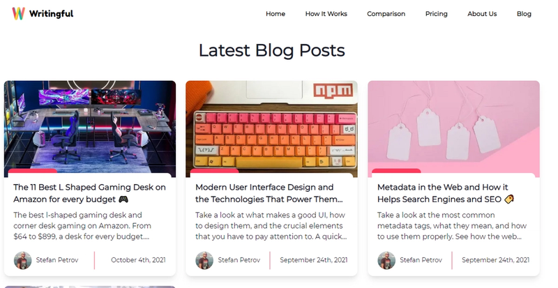
The blog post you’re reading right now is not.
Next.js has this cool feature called incremental static generation. Pages using incremental static generation get built by the server as they're added. You don’t need to rebuild the entire website every time you add a new blog for instance.
You can set an optional revalidate prop that checks that web page once in a while and updates it if anything has changed.
Incremental static generation is basically server-side rendering that only builds the web page once, when the content is first added. It then behaves like static generation since all subsequent users receive the same cached page.
If you set a revalidate period, once the specified time passes, next.js will rebuild the page provided it has been updated and next.js detects changes.
//This is a page file in next.js

export async function getStaticProps({ params }) {

// Some logic goes here here

	return {
		props: { params },
		revalidate: 21400,
	};
}
// test.js
The key takeaways for static and dynamic pages are:
- Use static pages for pages that never change, such as about us and contact us pages
- Use front-end hydration for things like dashboards, i.e. pages where crawlers like Googlebot don’t have access to anyway
- Use server-side rendering only for pages that get updated very often
- Use incremental static generation (if you’re using Next.js) for everything else
5. Reduce unused CSS, packages, and modules
Another great way of improving website speed is to remove unused CSS and uninstall any packages or modules that are no longer in use. As websites grow, some junk inevitably gets left behind.
If you're not a developer ask your developer to go over the entire project once in a while and update dependencies both for security purposes as well as optimization.
If you've recently added new features or changed major aspects of your website, it's good practice to check for unused packages and modules, and uninstall them.
I highly recommend using Depcheck to find unused npm packages and remove them. It's a great tool that saves a lot of time and frustration since you don't have to manually check for unused dependencies.
If your web pages take forever to load, definitely try reducing redundant code and dependencies.
6. Preload above the fold items
Preloading an object simply means requesting that resource even before the browser has discovered it in HTML. The server sends the object immediately after the initial request, causing it to load quicker and be visible sooner.
This is typically used for images that are above the fold. You want to avoid preloading more than a few things at once since it can slow down your web page if you preload EVERYTHING. That’s what lazy loading is for, remember?
Above the fold refers to everything the user sees when they first land on your webpage.
Writingful's landing page has an above the fold that looks like this:

Although this can vary depending on the device used, the screen resolution, etc., developers generally know what to prioritize and what to lazy load.
In my case, I would want to prioritize loading the hero image first and perhaps the three feature images below since they’re also visible as soon as you open the website.
This is how you do it with Next.js. It's really simple, you just add a priority prop:
<Image
		src="/some-image.png"
		width="400px"
		height="450px"
		alt="Hero Image"
		priority
/>
// test.js
If you’ve been wondering how to improve website load speed with minimal effort, preloading is the answer.
7. Minify CSS (manually or automatically)
Minification helps cut out unnecessary portions of your code and reduce file size. Like most other forms of code, CSS was written to be easily understandable by people. As such, CSS contains spacing, comments, indentation, etc.
CSS minification allows us to remove these extra bits of code and only ship out the necessary parts needed for the website to function properly.
You can use several online free CSS minifiers such as Easy Minify, CSS Minifier, and Minify Code, to minify for your CSS and make your website load quicker.
You can also use an npm package such as CSS-minify to minify a single or multiple CSS files at once.
I should point out though that a lot of modern frameworks such as next.js automatically minify CSS for you. Next.js for instance automatically concatenates your CSS into a single minified .css file.
Minifying CSS is a great solution if your web page loads slowly and you’re looking to speed it up.
8. Reduce the number of DOM elements
The DOM is an object-based representation of HTML and XML documents. It defines how a website is structured. Everything you see on a website is an object (or an element), but there are way more elements that you don’t see than the ones you do.
A great tip is to try and avoid nesting DOM elements inside other DOM elements where it isn't necessary. For instance, instead of using this:
<div id="navigation-main">
    <ul>
        Sample Text
    </ul>
</div>
// test.js
Try to use this:
<ul id="navigation-main">
   This is better
</ul>
// test.js
Obviously, you'll sometimes need to wrap an element inside another element where the layout requires you to do so, but try to avoid doing that as much as possible.
Another tip is to avoid using <br> tags since they also count as a DOM node.
In footers, instead of using lists like so:
<ul>
<li><a href="/">Home</a></li>
<li><a href="/blog/">Blog</a></li>
</ul>
// test.js
Simply use anchor tags:
<ul>
<li><a href="/">Home</a></li>
<li><a href="/blog/">Blog</a></li>
</ul>
// test.js
This simple change reduces the number of nodes from 5 to 2 in this particular example.
If you're using Chakra UI like I am this is a bit hard to do since everything in Chakra is based on using specific components.
It can become really easy to start using way too many components just because of how convenient they are. Case in point:
In the how-not-to-do-it scenario above, I'm using a flex component, which is just a div element with a flex display property and a width of 100%. I’m then wrapping it around a center component that centers the child elements inside.
import { Flex, Center } from "@chakra-ui/react";

const Footer = () => {
  return(
  <Flex w="100%">
    <Center>
      <p>Just some text</p>
    </Center>
  </Flex>
  );
}

export default Footer;

// test.js
Instead, what you should do is use a single component wherever possible and style it yourself using props. So, the code above will transform into this:
import { Flex, Center } from "@chakra-ui/react";

const Footer = () => {

  return(
  <Flex w="100%"
    justifyContent="center"
    alignContent="center">
    <Center>
      <p>Just some text</p>
    </Center>
  </Flex>
  );
}

export default Footer;

// test.js
It’s amazing what simply refactoring your code from time to time does to rectify the issue if your webpages load slow.
9. Reduce animations
Last but not least, I strongly suggest you avoid using animation as much as possible and only animate what is necessary or what you consider an absolute must.
Never use animate for simple tasks or effects. Use the transition property to smooth out components, such as how cards behave when hovered or how buttons behave when clicked.
Framer motion is an excellent library for React and it comes with a lot of cool features, but in my experience, it also comes with a hefty page speed penalty. If the user is using a slower laptop or phone the website will take longer to load and display the animations.
I'm not saying don’t use animation at all, but I am saying to use it sparingly and only where it makes sense. After all, using too much animation is worse than using no animation at all. Using a ton of animations will cause the web page slowing down browser.
Take a look at FitnessDocumentation and their landing page. This is a perfect example of how to use animation to add some visual appeal without overdoing it:

Use animation to add a bit of eye candy to your website if necessary, but remember that your clients are there to read something or purchase a service or product, not to be impressed by an animation that causes their browser to lag.
Did you enjoy this article?
If you did and want to order similar content for your own website, click the button below. We cover most industries and topics. If you have any questions, don't hesitate to contact us at [email protected]
About the author
Stefan is the founder and owner of Writingful. He's been working as a freelance writer for over 6 years, writing about anything and everything. His expertise lies in the Automotive industry, SEO and IT. He even built Writingful using Next.js and Sanity.io.
Services
Content Writing
Blog Writing
27 Old Gloucester Street
London, United Kingdom
WC1N 3AX
Privacy Policy
Terms of Use
© 2021 Writingful.
All Rights Reserved.