Modern User Interface Design and the Technologies That Power Them 💻


Stefan Petrov
September 24th, 2021
IT
Building and designing a modern web or mobile app is rather difficult. You have to plan out the entire project, decide what technology stack you’re going to use, and then actually go ahead and implement it. One of the most overlooked yet crucial aspect in this entire process is user interface (UI) design.
Although not everyone can tell you what UI design is, let alone list what traits a good UI should possess, chances are they can feel its absence. Modern UI design is all about making a web or mobile app feel and look innovative and up-to-date. Even if you’re not a massive techie or someone with an eye for aesthetics, you can probably tell what looks modern and what looks dated.
Although UI design is a complicated and lengthy topic, I’ll try to go over a few elements most modern websites have which separate them from the rest and place them in the top 1%.
1. Color scheme

The first thing you notice when you land on a website is the color scheme. Before you even read a word or a sentence, you notice how the website is put together and how well the colors match and blend. Modern websites should use a single main colour and one or two secondary colours to create a user interface that’s exciting to look at.
This is an example of a website which utilizes a single warm colour as the background, and a livelier, sharper secondary colour to draw your attention to the important bits. All the buttons and links are easily visible and immediately pop out at you, making them hard to miss. The CTA button is incredibly sharp and inviting, driving click through rate (CTR) up and boosting conversions.
This website on the other hand is an excellent example of what to design if you want your visitors clicking off the website and closing the tab within the first 3 seconds. Nothing is clearly defined, the colours don’t mesh together at all, and it feels like something you’d see when the web first took off in the early 2000s.
It’s okay to choose a bold color scheme or use something that’s representative of your brand and logo, but always be mindful not to overdo it and be tasteful when implementing your solution.
2. Fonts and font size
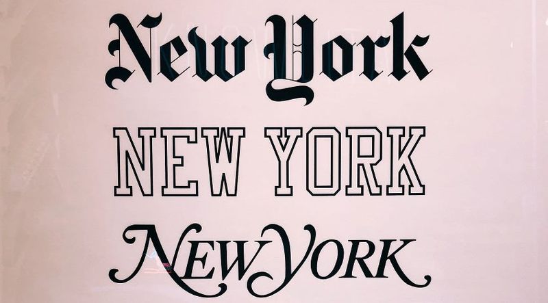
I often see many websites mixing and matching fonts like there’s no tomorrow. Although it’s not against the rules to use multiple fonts for a single website, you should avoid using more than 2 or 3 at most. Not only that, but you have to make sure they’re pleasing to look at and they go well together.
Here’s a website which uses different fonts for the headings and the paragraphs, but it doesn’t look mismatched or awkward because the fonts complement each other nicely. They’ve also used appropriate sizes for the headings and the body, i.e. they’ve made the headings nice and large so you can read them at a glance when scrolling, and the body font is decently large for people who are visually impaired as well.
On the opposite end of the spectrum we have this website, which is a right old mess. Not only does it look weird with these ‘interesting’ fonts, but I don’t think you could read it for over a few minutes without getting a headache.
The takeaway here is to use clear fonts and prioritize readability over being unique. There’s a reason people don’t deviate from a handful of fonts which are responsible for over 90% of all text on the internet. Google offers hundreds of free fonts for use on the web, with some of the most popular being Roboto, Cairo, Montserrat, Arvo, Lato, and Ubuntu.
Remember, it’s more important for your visitors to be able to read your website’s content rather than be wowed for three seconds and despise it afterwards.
3. Bug-free and secure

It goes without saying but any modern website should use HTTPS to establish a connection and have a SSL certificate installed. Not only does it look amateur-ish to not have SSL and HTTPS, but it poses a security threat as well.
If your website is hosted on Wordpress, installing an SSL certificate is easy as there’s tons of plugins which take care of the entire process and streamline it. Let’s Encrypt is the most popular issuer of SSL certificates (it’s free), but there are plenty of paid ones as well if you’d rather go with another company.
Make sure your website is bug-free as well. Visitors shouldn’t be surprised by an unhandled error or a random error stack trace notification. It’s okay if an error happens, just make sure you have a contingency plan in place to deal with it and redirect the user or take the appropriate actions for your use case scenario.
4. Consistency
Your website should have the same look and feel on every page. Whether the visitor is scrolling through the blog section or looking at the ‘Contact Us’ page, it should be immediately apparent that they’re on the same website and they haven’t been redirected to an external URL.
I know this sounds ridiculous, but I still see it happening today. The landing page looks sweet and awesome, you click on ‘Blog’ and you’re suddenly taken back to 2008 and a time when styling your website was optional. Make sure your website/app feels similar across all pages and sections. It’s not just visually pleasing, but it also helps solidify your brand values and appearance.
If you utilize a mobile app as well as a website, make them as similar as possible to establish a connection between the two. Use the same color palette, implement the same elements wherever possible, and try to have the same internal page structure if applicable.
The benefits of this are two-fold. Firstly, it’ll reduce learning time as it limits the number of actions and operations needed to learn and adapt to the new environment. Secondly, it’ll eliminate confusion as to whether the user has installed the correct app or a similar app which can be confused with yours.
5. Animation and interaction

A bit of interactivity is great, but avoid making the website a clutter-fest of moving elements and unnecessary junk. Buttons and dropdown menus lend themselves well to animation as they’re often visited and clicked, but they aren’t distracting of their own accord.
Remember that not every page component has to be animated or interactive. Sometimes it’s best to leave some things fixed and easy to spot. After all, users want to read the website and the content on it, not be ‘amazed’ by the developer’s ability to animate the living hell out every div on the site.
Animation makes a web page both slower to load and slower to render. Most animation packages (for example NPM if you’re using JavaScript) weigh quite a bit, meaning that’s an extra resource the client browser has to make just to make the page interactive.
Not only that, but mobiles are often slower than desktop computers when it comes to rendering the actual site and the DOM. Some of the older mobiles can also struggle with animation once the site is loaded as well.
The key takeaway here is this: make the site interactive and modern by animating components which are clickable or change display properties (such as dropdowns, accordions, pull-out sidebars, etc.)
Modern front-end technologies

Most modern front-ends rely heavily on JavaScript to create a nice and pleasant user experience. JavaScript is the language that animates the internet and makes it interactive. To that end, developers started building JavaScript front-end frameworks back in the late 2000s to make building and designing websites easier and smoother.
Gone are the days of HTML templates and template engines. Today, the most popular front-end frameworks are built on top of JavaScript and include Facebook’s React, Google’s Angular, and the gaining-in-popularity Vue (which has built by a Google employee after he left the company).
Conclusion
Designing a user interface is not as straightforward as it once was. Nowadays, to make a pleasant user experience for your visitors, you have to carefully plan and execute the development of the front-end and make sure all the jigsaw pieces are in place.


Did you enjoy this article?
If you did and want to order similar content for your own website, click the button below. We cover most industries and topics. If you have any questions, don't hesitate to contact us at [email protected]


About the author
Stefan is the founder and owner of Writingful. He's been working as a freelance writer for over 6 years, writing about anything and everything. His expertise lies in the Automotive industry, SEO and IT. He even built Writingful using Next.js and Sanity.io.
Services
Content Writing
Blog Writing
27 Old Gloucester Street
London, United Kingdom
WC1N 3AX
Privacy Policy
Terms of Use
© 2021 Writingful.
All Rights Reserved.